


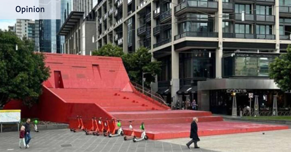
On an average day, around 40,000 people pass along Southbank Promenade. In the middle of an otherwise orderly bluestone-and-glass corridor – one that could be mistaken for the Southbank of any major city – sits a giant, slightly odd, bright red staircase that leads to nowhere.
I’m talking about the Red Stair amphitheatre.
Designed by Marcus O’Reilly Architects with sculptor Nadim Karam in 2005 to obscure the entrance to the Crown casino car park and spruce up Queensbridge Square ahead of the 2006 Commonwealth Games, the Red Stair was always a bit much – and that was the point.
The structure is showing its age, however, and along with the surrounding Southbank landscape, has long been on the City of Melbourne’s revitalisation agenda. Earlier this month, council voted to abandon a design competition that was set to make over the stairs, opting instead for an internal redesign, featuring a proposal that stripped the very red from the Red Stair, replacing it with a muted, sensible – arguably trendy – palette that blend more seamlessly into its bluestone and mirrored-skyscraper surroundings.
Fine. The Red Stair is nearly 20 years old and it needs attention. But I fear this is part of a broader drift that extends beyond one landmark’s colour palette.
Melburnians, we have stopped having fun with our urban design.
Public design in this city increasingly seems determined not to stand out. Trying hard, in other words, to be cool. Restrained design is becoming the default. Which raises the question: what is the public realm of our “creative city” becoming as we commission, approve and “improve” public space – and why does so much of it now equate seriousness with quality?
Take the humble public bench. It is shaped by careful technical standards: height, armrests, weight-bearing capacity, joinery are all meticulously codified to ensure public design is safe, durable and accessible. But while there is plenty of guidance for how a bench must function, there is no rule that says it must be drab. Nothing says it must be grey timber or green steel. By the same logic, there is no design standard that says a civic square should never be odd, playful, challenging, or even a bit fun.
Melbourne already knows this. The mosaic “couch” benches in Fitzroy by ceramic artist Giuseppe Raneri are camp, cheeky and unmistakably local in a sea of standard-issue street furniture. Simon Perry’s Public Purse in Bourke Street Mall is equally camp: a giant granite handbag that is both sculpture and seat while cheekily thumbing its nose at consumerism. Deborah Halpern’s strange mosaic creatures, Ophelia and Angel, may be of their time, but they have become proud guardians of our city. While on the corner of Smith and Gertrude Street, the heartland of Fitzroy and Collingwood’s iconic queer venues, the rainbow crossing proudly signals to punters exactly where they are while asserting neighbourhood’s identity.
These interventions might not all be universally loved, but they are identifiable markers in our landscape because they are bold enough to register.
Now set those against places where Melbourne could have been braver, but chose a safer language instead. The new public spaces unlocked by the Metro Tunnel stations were a tremendous opportunity, yet the designed realm repeatedly returns to the same palette of bluestone, timber and native understorey planting, despite room for something bolder.
Nowhere is this more apparent than City Square. For those born after the 1990s, it would be hard to believe that the recently reopened square once featured graffiti walls, tall trees and waterfalls where children played across sunken levels — as well as being home to the infamous Vault (a.k.a. “Yellow Peril”). Over time, only one water wall and a thin moat remained. Now those too have been replaced, making way for more seating, poured concrete ledges with anti-skating studs, and native planting. Certainly, the new design is peaceful, improves local biodiversity, and adapts well for events. But did all the fun have to go? Why does its former unhinged design ethos seem so unfathomable today?
Ironically, design that doesn’t take itself too seriously is often the product of very serious work. Playful does not mean reckless or poorly considered; the best playful designs are technically rigorous and socially generous. They simply refuse the idea that public space must look as though it was assembled entirely from approved finishes and low-risk palettes.
To be clear, this is not an argument against restraint. Minimalism can be elegant, and quiet urban public spaces matter. But we seem to have forgotten balance. A healthy public realm offers a spectrum: places that soothe and places that surprise; spaces for stillness and spaces that invite curiosity, movement and even a bit of challenge. In Melbourne, that spectrum is narrowing – and we are risk-managing a lot of joy out of the city.
Which brings us back to the Red Stair. The city can repair and adapt it, improve sight lines and accessibility, and use more durable materials. But consultation should not become a polite exercise in sanding off the edges of a place that was always meant to be a little theatrical. If the Red Stair is going to change, Melbourne should at least keep its nerve: retain a bold visual identity, preserve the amphitheatre’s social role as a place to gather and watch the city, and commission something allowed to be distinctive rather than merely unobjectionable – something that doesn’t take itself quite so seriously.
Dr Rachel Iampolski is an urban geographer and creative producer.
The Opinion newsletter is a weekly wrap of views that will challenge, champion and inform your own. Sign up here.
From our partners
Read the full article here


